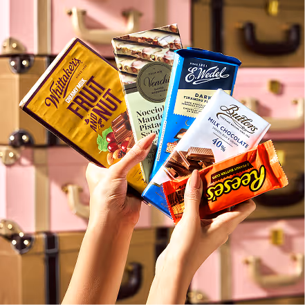
Cococart is a homegrown chocolate retailer that brings some of the finest international chocolates to India. What began as a single retail format soon grew into cafés and combined spaces, giving people more ways to discover and enjoy chocolate. With shops across the country, Cococart quickly became a much loved name for chocolate lovers in India.
The Problem
But as the brand expanded, its identity began to scatter. Cococart stood for retail, Cococart and Café for combined spaces, and Cococafé for standalone cafés. Each format had its own look and feel, and apart from the logo there was little to hold them together. Without a unified message across India, the brand lacked the recall and resonance it needed. Cococart was ready for an identity that could tie its formats under one story and still capture the joy of chocolate.
Our Approach
We reimagined Cococart as a whimsical traveller, a curator who brings joy and indulgence from around the world. The brand shifted from being just a retailer of chocolates to becoming a creator of magical moments. Every bite, every visit, every package became a discovery, carrying the same sense of wonder.
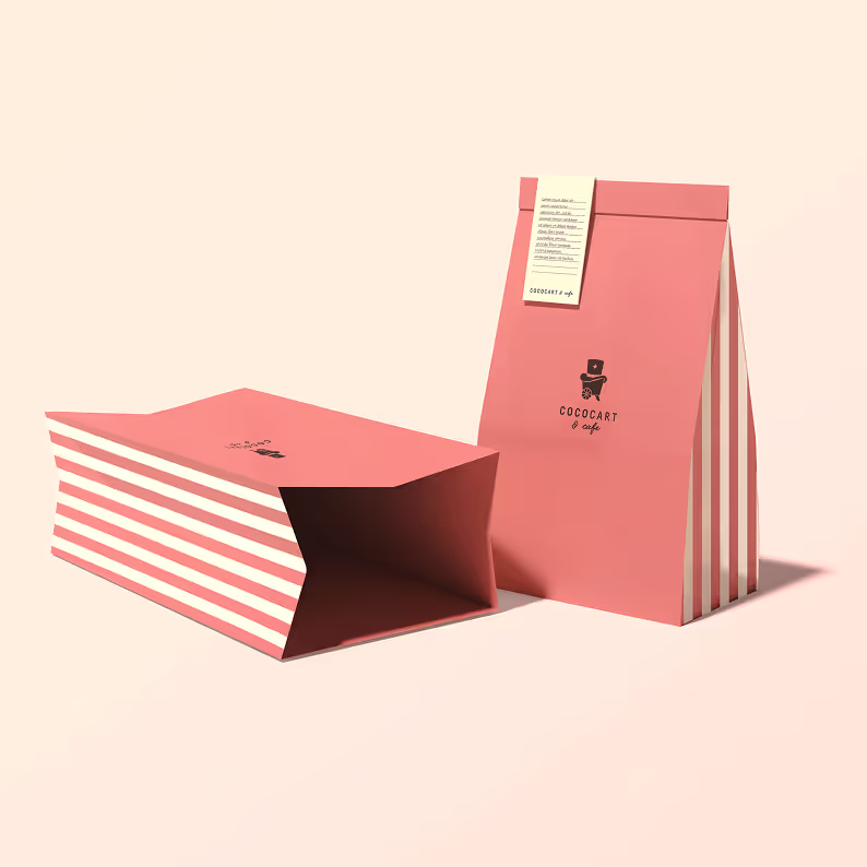
We did not change the Cococart logo completely. The typographic logo remained the same to retain familiarity, but we introduced an emblem, a logo mark that could grow into the next symbol of brand recall. The emblem captured this new spirit with a magician’s hat placed on a cart, a playful nod to both the name and Cococart’s role as a bringer of indulgence and delight.
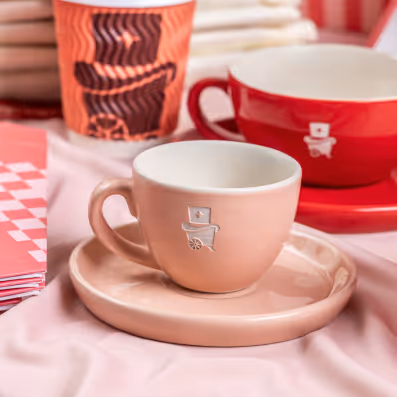
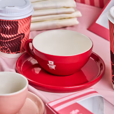
Colours built on this foundation. Coral, the brand’s existing primary colour, stayed at the centre - a shade they were deeply connected to and wanted customers to instantly recognise. Chosen for its sense of playful indulgence rather than a gourmet feel, coral remained the anchor while maroon, soft pinks, and browns added warmth and depth around it.
We retained Cococart’s existing typefaces - Megafield as primary font to bring character and warmth to the brand, while Fabrikat as secondary font to keep communication clear and easy to read. Together, they felt natural to Cococart’s personality, so we chose to build on them rather than change what already worked.


Illustrated hands perform playful food actions, from holding cookies to pouring milkshakes. They bring the magical, whimsical world of Cococart to life.
The star symbolizes celebration and joy, marking every indulgence as a special moment. It appears across packaging and touchpoints, adding sparkle and delight.


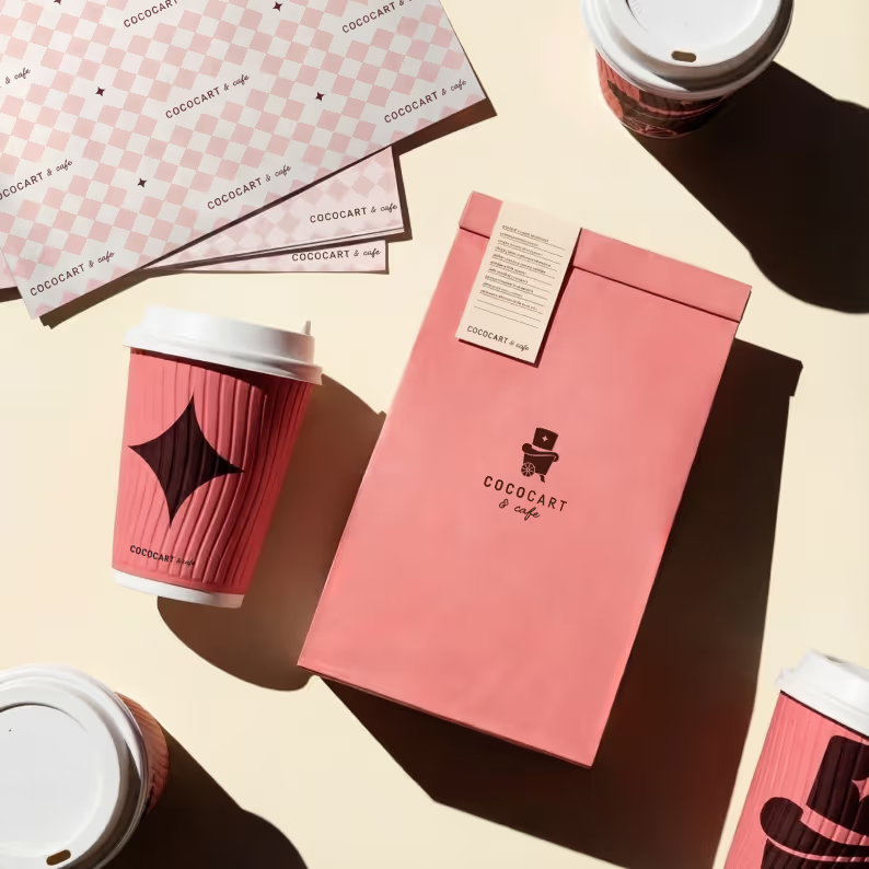

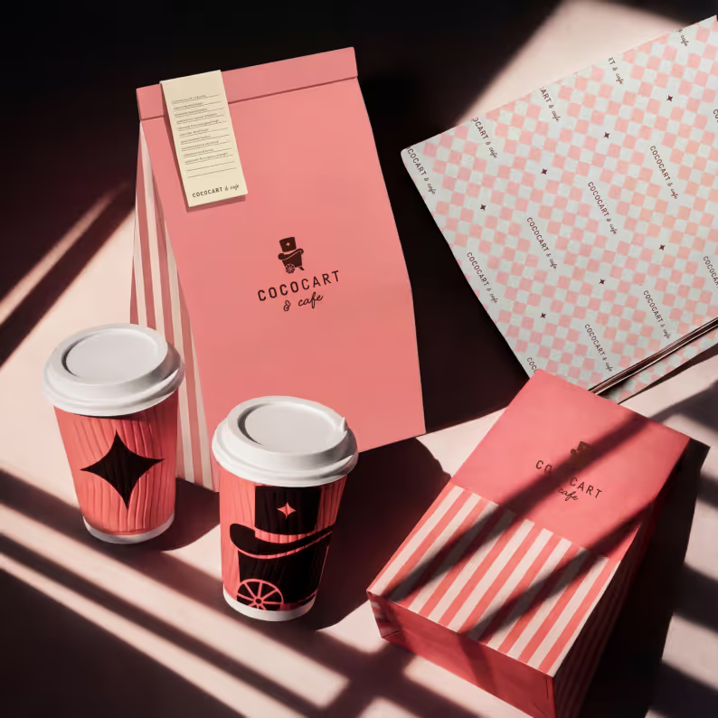
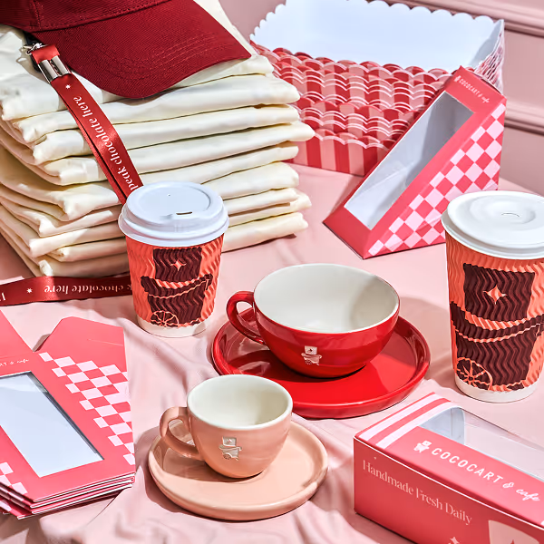
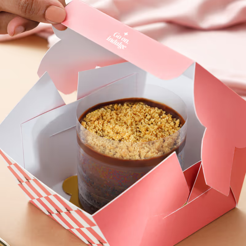
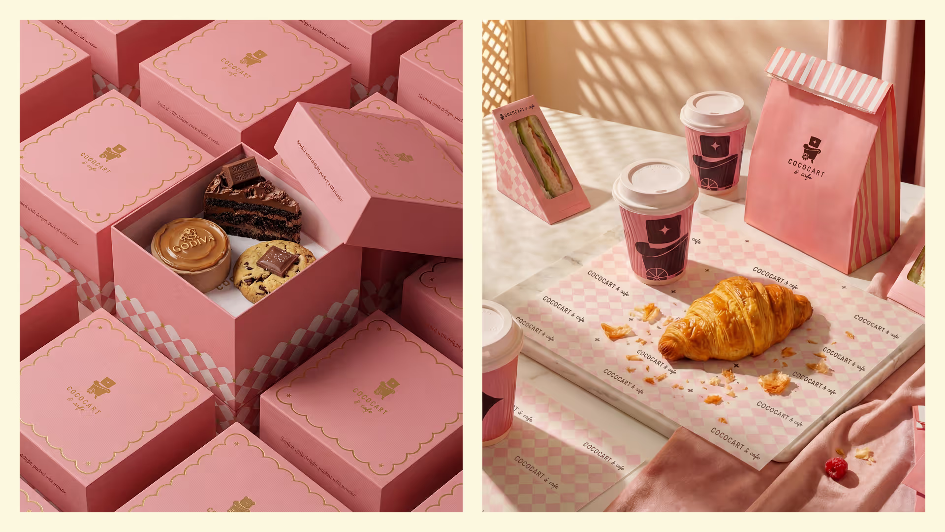
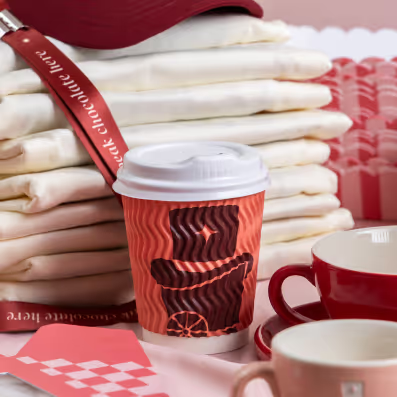
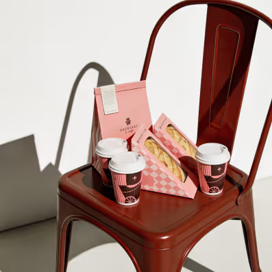
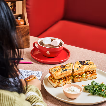
Packaging became a canvas for this new identity. Coffee cups, sleeves, cake boxes, bags, and wrapping paper were all redesigned to carry the same charm. The emblem, colours, and illustrations worked seamlessly across every item, making the entire range feel like one family. Whether someone picked up a hot chocolate in a café or a gift box in store, the experience was instantly recognisable as Cococart.


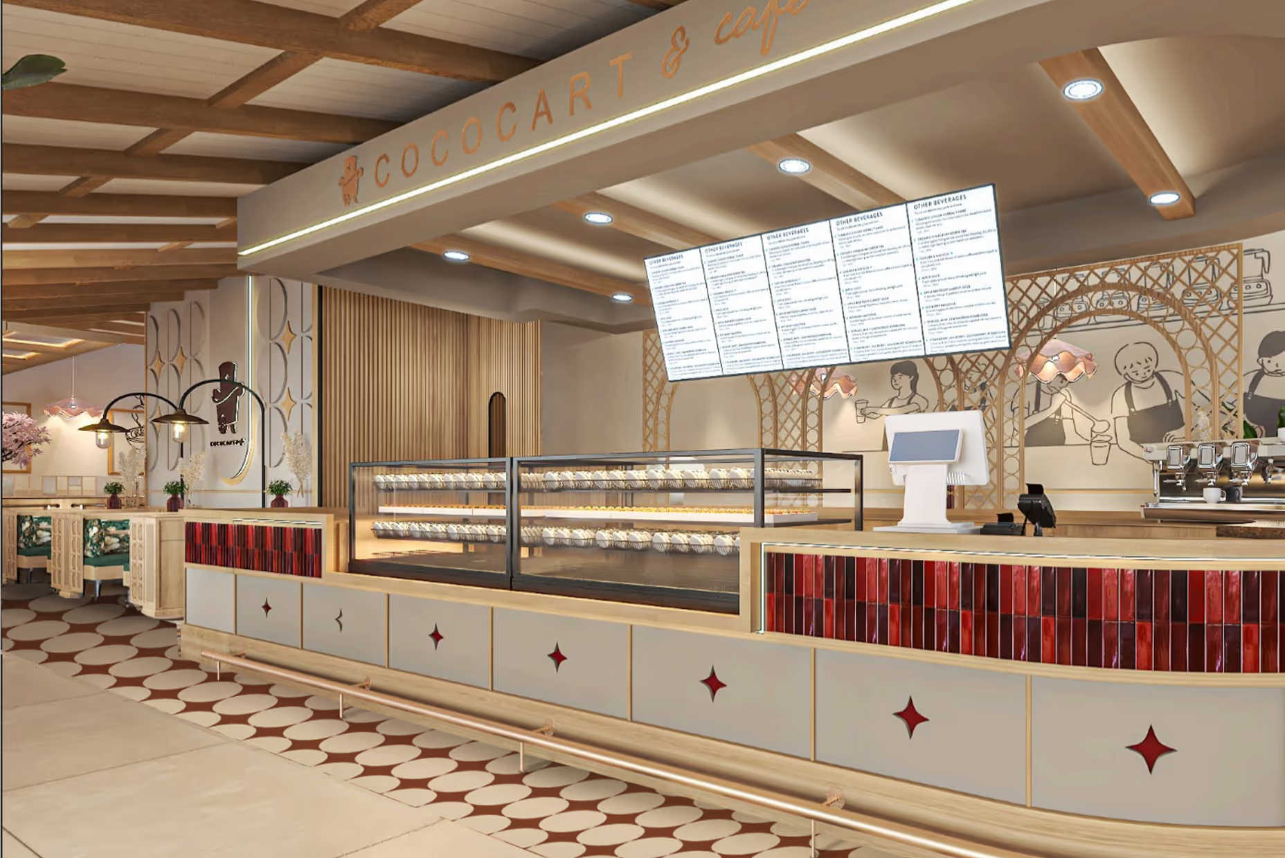
This sense of magic also found its way into the physical spaces. Floors carried star patterns in the tiles, while walls came alive with playful illustrations of magician’s hands, sprinkling stars, whisking up treats, or conjuring surprises. Instead of feeling rigid or systematic, each café looked spontaneous and full of life, carrying the same playful spirit as the brand.
We created social media IPs as content buckets like IN/OUT, blindfold taste tests. For each IP, we designed repeatable units that the brand could post again and again, with every unit feeling fresh while staying on-brand.


Content creation brought this idea to life by capturing the team enjoying chocolate behind the scenes, showcasing the full range of Cococart offerings, and highlighting products up close. This approach not only shared their passion but also made the brand feel approachable and full of personality.
