When Aken, Aadit, and Sanjana came to us, the ambition was clear. Born out of deep scientific knowledge and a dedication to health, they wanted to create supplements that go beyond the surface and work at the very source - the cells. Every product was crafted to support cellular function, combining the power of science and nature to improve not just lifespan but healthspan, so people could live better, not just longer.
Our Approach
CNTH was positioned as a supplement brand that is a confident guide for modern living. We shaped a voice that was clear and empowering, motivating people to make their own choices at their own pace. The brand archetype we chose was Hero & Mastery - one built on strength, discipline, and transformation. It positioned CNTH as a motivator and guide, helping people rise above challenges and improve their health the right way, through skill, knowledge, and consistency.
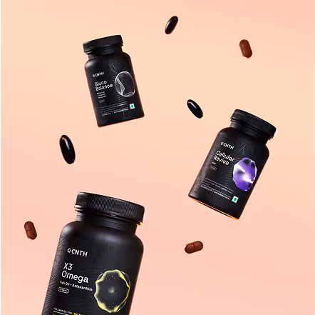
Each product name is derived from its purpose. We named the blends after what they do and where they act, simplifying complex science into intuitive understanding.
We started with the logo system. The wordmark was set in a bold sans serif to give the brand a strong, confident presence. The wordmark blended CNTH with the silhouette of a capsule, creating a logo that’s both brand-defining and product-representative with the flexibility to stand on its own as recognition builds.
A classic sans-serif, Tenon with rounded edges was the apt choice to bring warmth into the system. Different weights created a natural hierarchy, and the result felt sincere, modern, and trustworthy.
We developed a tone of voice that is clear and considered, always respectful of the reader’s time. It avoids jargon and instead communicates science in a way that is simple and relatable. The voice is empowering but never preachy, gently guiding people without telling them what to do.
%201.avif)
-%201.avif)
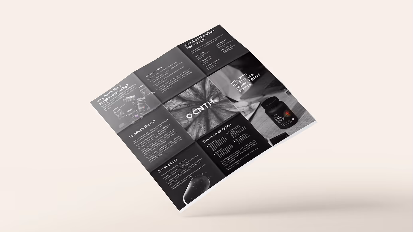
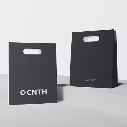
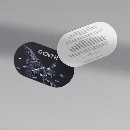
We extended CNTH’s identity across collaterals that made the brand experience consistent and engaging. A pill-shaped notecard introduced the products in a personal way, while the box with its pill silhouette, interactive text, and empowering copy, turned unboxing into a moment of choice and control. We also created a brochure that broke down the science, expertise, and supplements with clarity, and a handbag designed in a pill-inspired format, reinforcing the silhouette across multiple touchpoints.
A detailed roadmap to keep CNTH consistent and true to its essence. From logo proportions to packaging details, every specification ensures the brand looks, feels, and speaks the same language, no matter who carries it forward.
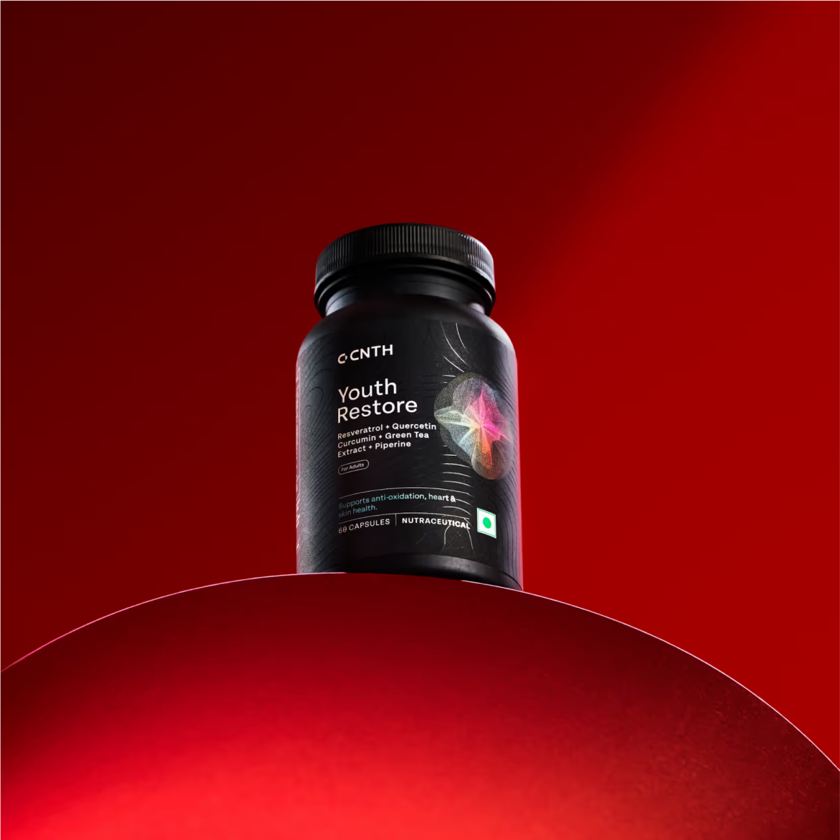
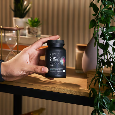
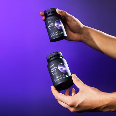
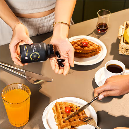
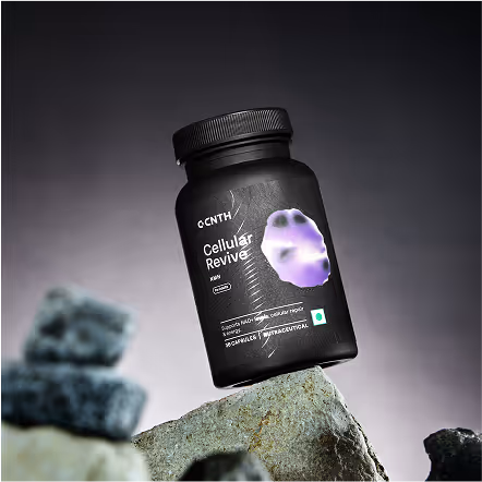
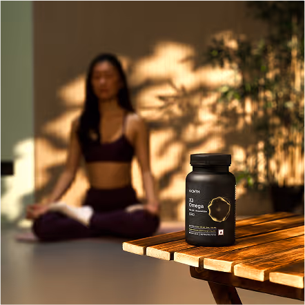
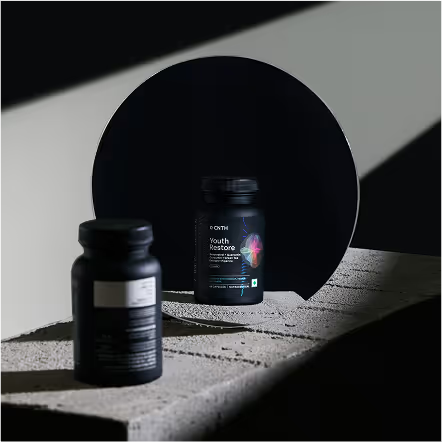
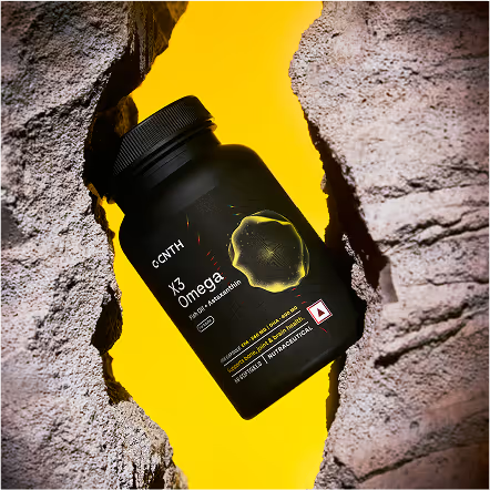
There were 2 approaches for photography. Product shots kept the bottle at the centre, styled with clean props like stones and risers to highlight its minimal elegance. Lifestyle shots showed the supplements naturally fitting into daily routines - from workouts and gym bags to breakfast tables, making it clear that CNTH is not only for fitness enthusiasts but for those invested in better health.

Through this process, CNTH’s visual identity was crafted to be both modern and trustworthy, translating complex science into approachable design. Every element from logo to packaging to photography now works in harmony to communicate the brand’s commitment to healthspan and mastery. The cohesive design language strengthens recognition and builds confidence, positioning CNTH as a brand that empowers people to make informed choices for a longer, healthier life.