Crossword is one of India's oldest and most recognised bookstore chains. But bookstores have a geography problem. They live inside malls. Kids don't go looking for them. And a brand that's spent decades getting books into people's hands couldn't just wait for children to find their way in. Crossword needed to meet them where they actually were, right outside school gates, at the end of the day, when the bag is heavy and the mind is finally free.
So they set up the School Book Festival, a pop-up parked outside school gates where kids could explore, build a wish list, and hand it to their parents on the way home. Our job was to create an identity that made the whole thing feel like somewhere worth stopping for.
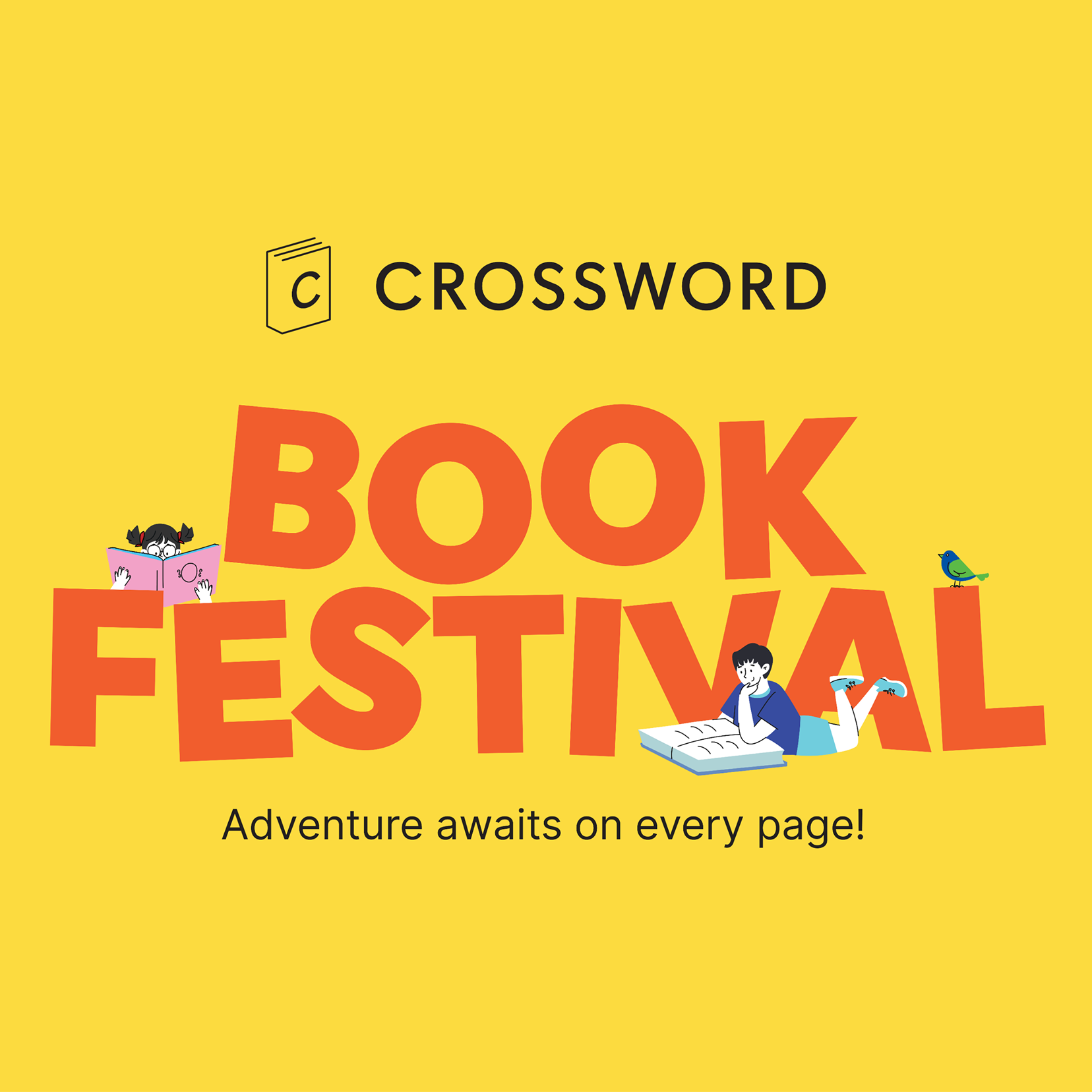
Anchored by the Crossword brand logo, the identity is built around a bold and playful wordmark. The visual language reflects children across age groups united by their love for books and storytelling. Whether integrated into the full illustrated scene or used independently, the logo remains central, with surrounding characters and elements engaging with it in an imaginative way.
Saturated primary colours bring the identity to life. Vibrant and full of energy, they’re designed to catch the eye of anyone passing by, whether a child or an adult.
The characters became the soul of the identity. The idea behind each one was simple: every book is a world of its own, and we wanted kids to feel that.
As the first introduction to the event, the digital invitation brought the identity to life for parents and teachers. Bold colours, clear communication, and a strong visual presence ensured it remained engaging across email and WhatsApp
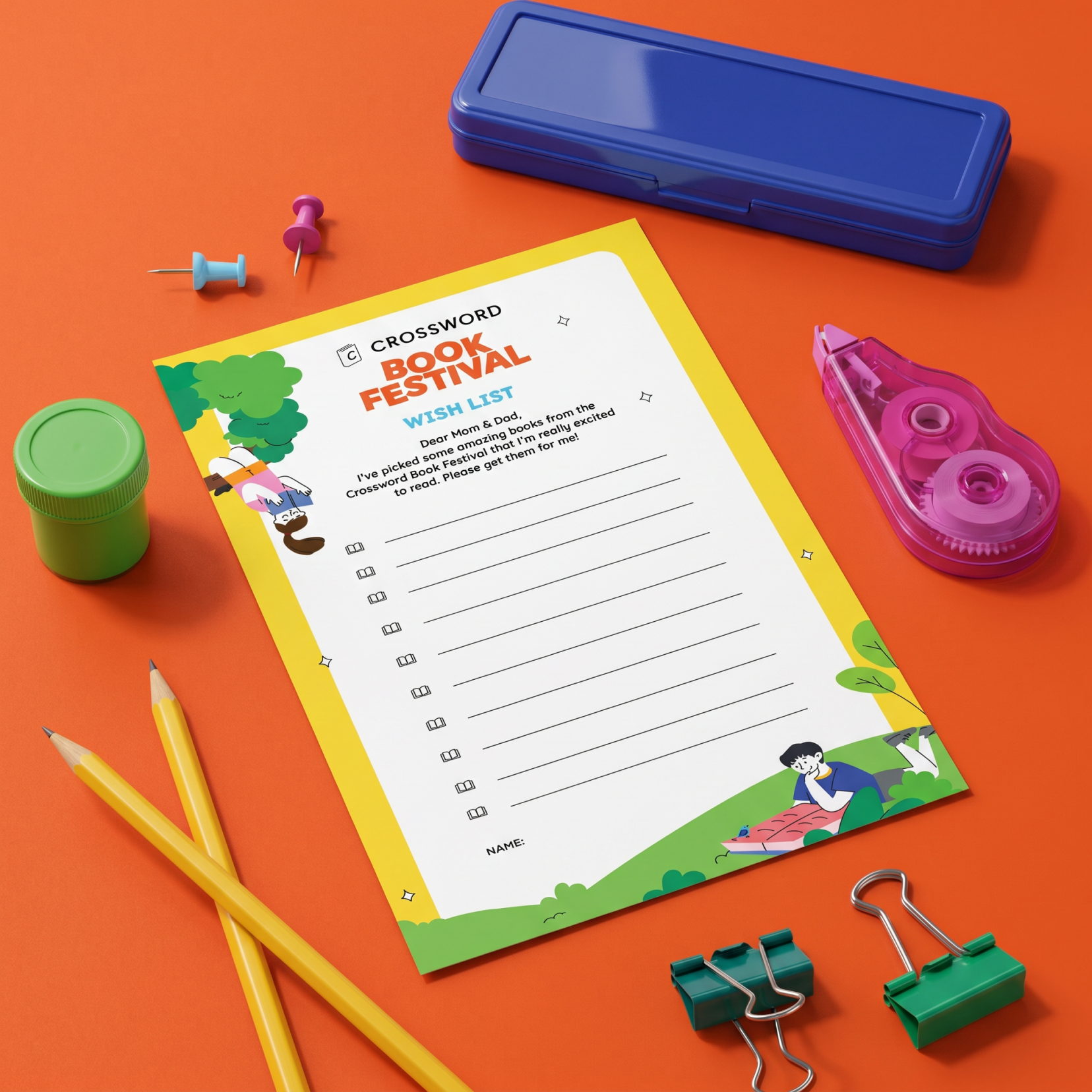
The wish list was a simple printable given to every child. It helped them keep track of books they wanted and made it easy for parents to buy them later.
The bookmarks carried illustrations of kids reading, handed out blank and meant to be coloured in. Something to take home and keep doing.
The photobooth brought the illustration world into three dimensions. Kids could step inside it.
A category template created for posters. Layout, illustration, and colour stayed fixed while the category label changed.
Posters across shelves and tables extended the visual world into every corner. The whole pop-up felt like one place, not a retail setup.
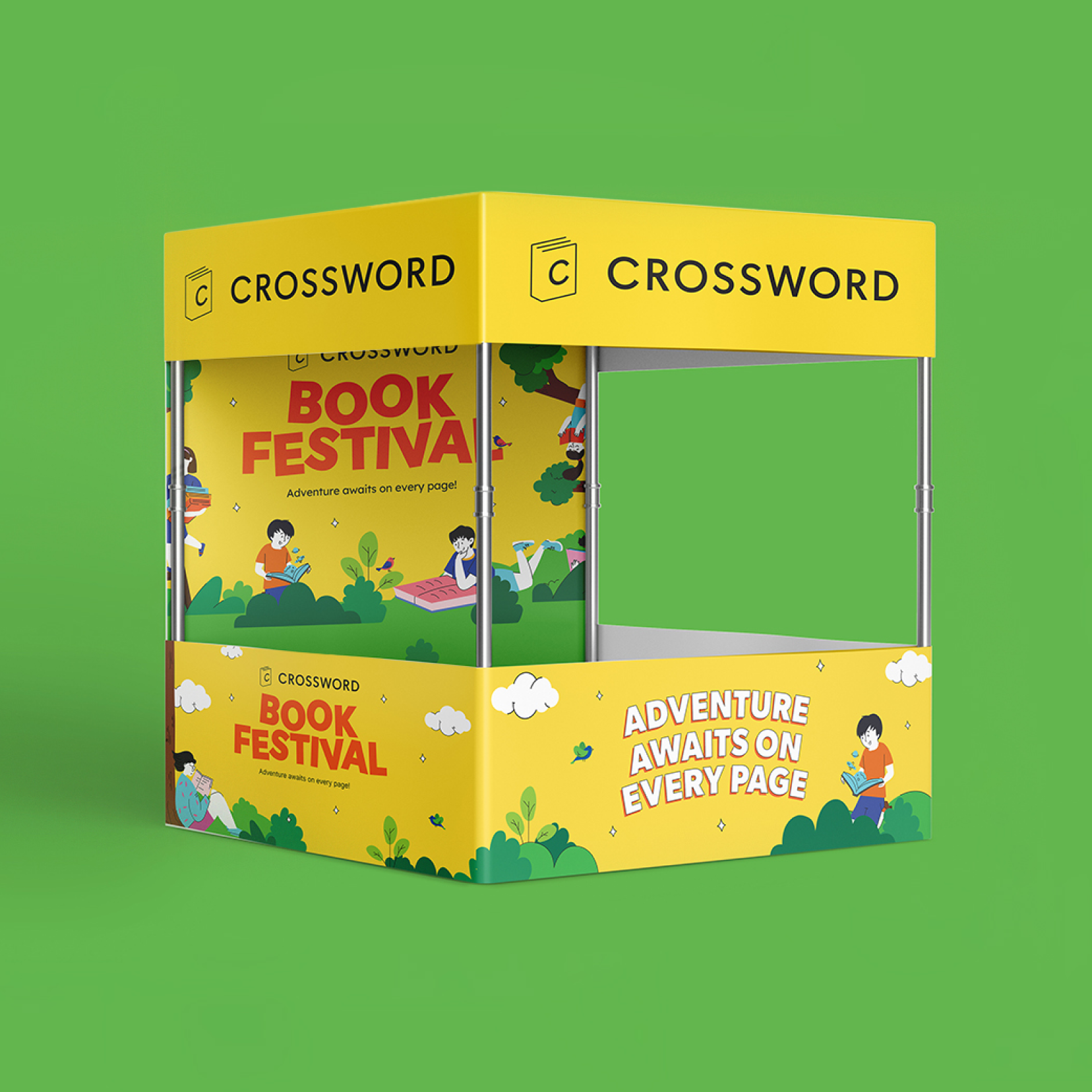
The billing and enquiry canopy kept the same colours and energy as everything around it. The experience didn't break the moment money changed hands.